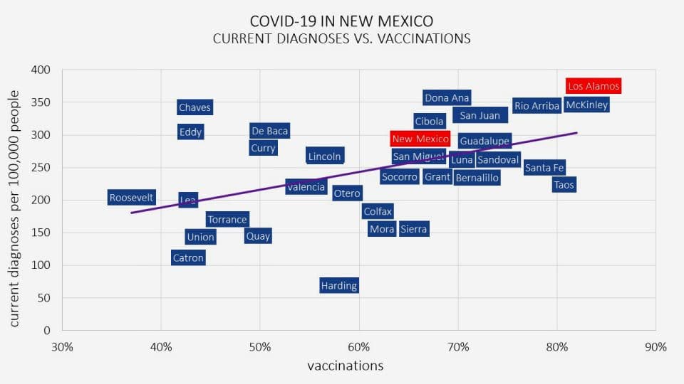
 This scatter plot shows the current 7-day average of diagnoses per 100,000 people versus the percentage of the population who ‘completed their vaccination series’ by county. Paradoxically, Los Alamos leads the state in current diagnoses as well as vaccinations. Furthermore, the trendline indicates that current diagnoses tend to be higher in counties with higher vaccination rates. Source: New York Times. Created by Eli Ben-Naim